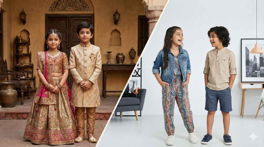
The Definitive Guide to Aesthetic Kidswear Colours Trending This Year
Children’s fashion used to stick to bold reds, blues, and yellows that screamed energy. But now, things have shifted. Parents want outfits that look put-together, like tiny versions of adult street style. Aesthetic kidswear colors trending this year bring soft, thoughtful vibes that mix comfort with cool factor. In this guide, we’ll break down the top shades shaking up kids’ closets. You’ll learn how to pick colors that grow with your child and turn everyday play into stylish moments.
These trends aren’t just pretty—they matter. Parents often buy what they see on grown-up runways, and that influences kids’ clothes too. Colors can boost a child’s mood or even help with focus during playtime. Think about it: a soft green might calm a busy toddler, while a warm terracotta adds a cozy feel to family photos. By choosing the right hues, you create wardrobes that feel fresh yet timeless.
Aesthetic in kids’ fashion means more than cute prints. It’s about curated looks that feel intentional, not random. Gone are the days of clashing neon. Instead, we see palettes inspired by nature walks or quiet mornings. This shift lets clothes work for school runs, park days, or special events without overwhelming the kid.
The Reign of Earth Tones and Natural Neutrals
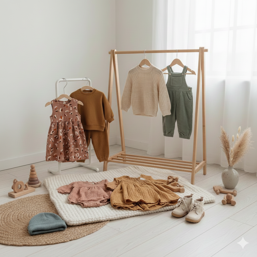
Earth tones ground kids’ outfits in a way that feels real and easy to wear. These colors build versatile wardrobes where pieces mix without effort. Designers love them for their nod to sustainability, pulling from soil, leaves, and sunsets.
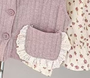
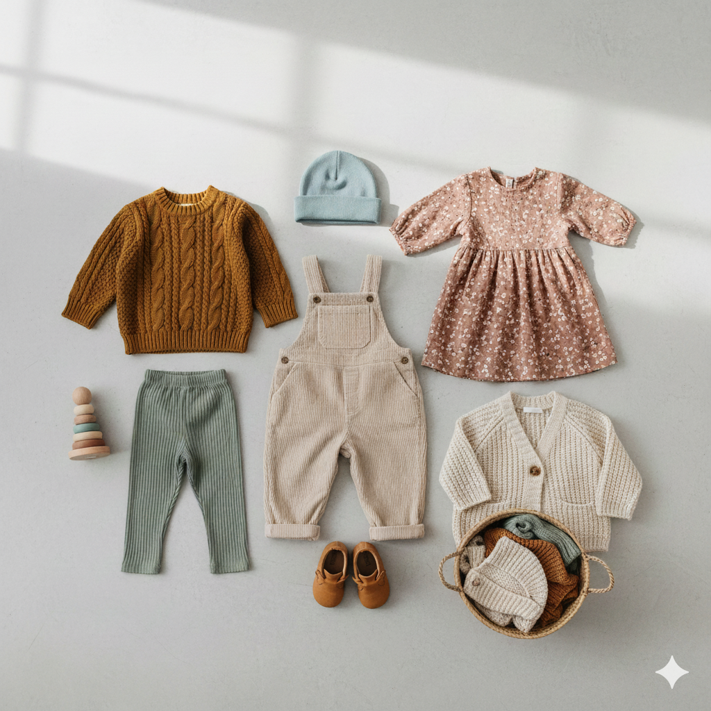
Dusty Rose and Terracotta: Warmth Without Intensity
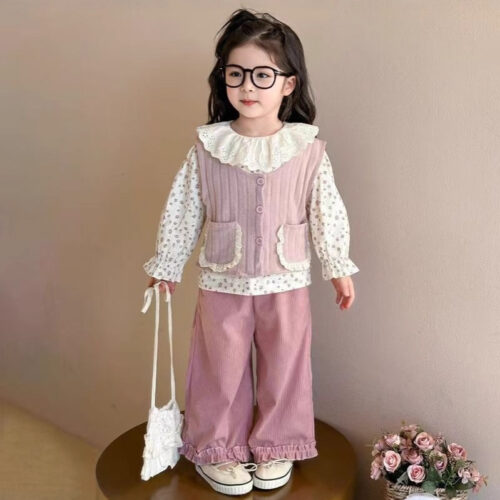
Dusty rose softens the old-school pink into something grown-up yet fun for kids. It works on everything from dresses to hoodies, adding a gentle flush like a sunset glow. Terracotta brings an orange-brown warmth that’s perfect for fall layers but light enough for spring.
These shades pop on natural fabrics. Linen skirts in dusty rose breathe easy on hot days. Organic cotton tees in terracotta hold up to rough play while keeping that earthy charm. Pair them with jeans for a look that’s casual but chic—ideal for family outings.
Kids in these colors seem more at ease. The muted warmth avoids the over-the-top feel of bright oranges. Brands like Hanna Andersson use them in everyday lines, showing how they fit real life.
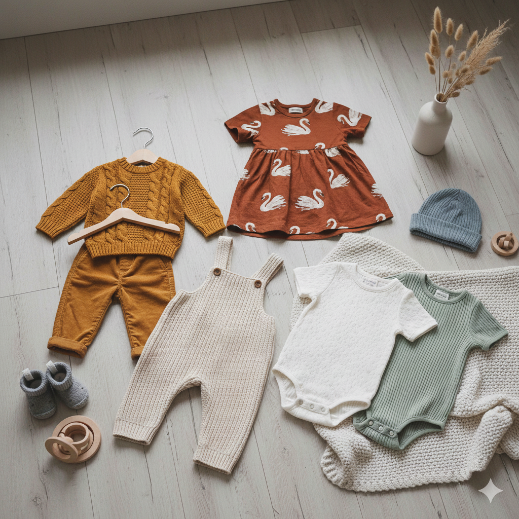
Sage Green and Moss: The New Foundation Colour
Sage green has overtaken plain beige as the go-to neutral. It’s like a whisper of forest air, fresh and calming for any child’s day. Moss adds a deeper twist, evoking wet leaves after rain.
This green suits boys and girls alike. Think cargo pants for adventures or cardigans for school. It layers well under jackets, making outfits adaptable year-round. Wellness trends boost its appeal—parents see it as a color that ties to outdoor fun and calm vibes.
Versatility makes it a winner. Mix sage with whites for crisp mornings or browns for cozy evenings. It’s everywhere in kidswear now, from pajamas to party wear, proving neutrals can lead the pack.
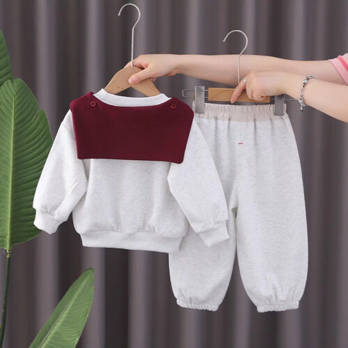
Cream, Ecru, and Oat: Elevated Basics
Stark white can feel too crisp for kids who tumble around. Cream softens that edge, like fresh milk with a hint of yellow. Ecru leans beige, while oat brings a toasty neutral that’s super wearable.
These create quiet luxury in play clothes. A cream sweater over jeans looks polished without trying hard. They hide stains better than brights, a big plus for parents. Textured knits in oat add depth, turning basics into favorites.
The trend nods to high-end adult fashion but scales down for little ones. You get that soft, lived-in feel right away. Stock up on these for a base that mixes with bolder accents later.
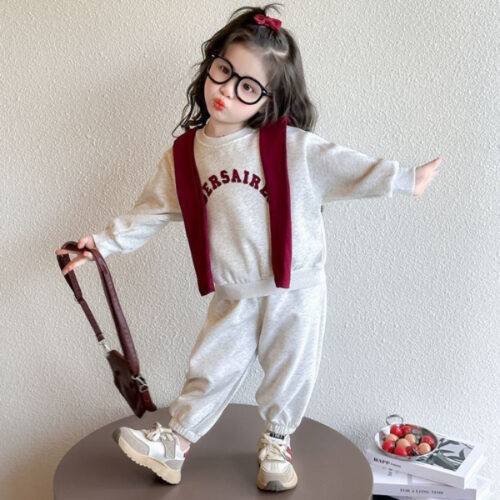
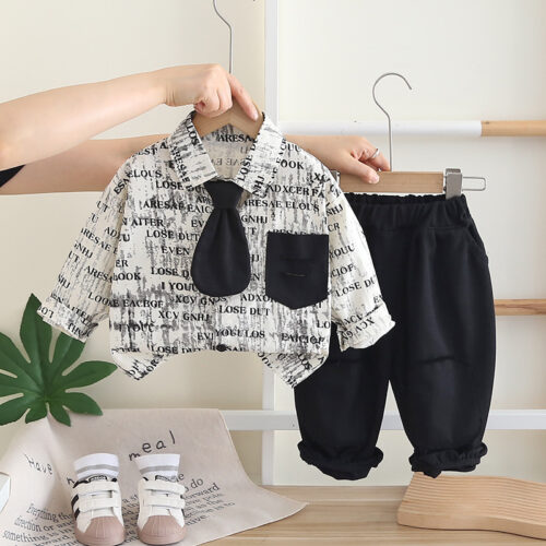
Muted Pastels: Sophistication Meets Playfulness
Pastels used to mean babyish pinks and blues. Now, they’re dialed back—desaturated for a grown-up twist. This keeps the fun but adds poise, perfect for kids exploring their style.
These shades play nice with daily life. They calm without boring, letting kids move freely. Parents love how they photograph well, capturing those soft, dreamy moments.
Powder Blue and Faded Lavender
Powder blue eases away from navy blues, offering sky-like calm. Faded lavender softens purple into a hazy bloom. Both feel gender-neutral, opening doors for shared wardrobes.
They tie into soft photography trends, where light diffuses like morning fog. A powder blue romper shines in natural light. Lavender dresses pair with boots for a cool edge. Kids wear them confidently, as the tones don’t shout.
Use them for all seasons. Layer faded lavender under coats for winter warmth. Powder blue shorts beat the summer heat. They’re staples in lines from brands like Mini Rodini.
Butter Yellow: A Gentle Pop of Sunshine
Butter yellow lights up without blinding. It’s pale, like fresh churned butter under sun. This accent color pairs magic with earth tones, adding joy to neutral bases.
It lifts sage greens or creams into happy territory. A butter yellow scarf or tee brings smiles on gray days. Soft on skin, it suits sensitive little ones best.
Designers call it the it-color for a reason. It fades gently in washes, gaining character over time. Try it in lightweight cottons for breezy outfits.
Actionable Tip: Creating a Muted Palette Capsule Wardrobe
Build around three to four shades for endless combos. Start with sage green pants as your base. Add a cream top and butter yellow jacket for variety.
- Pick versatile pieces: Two tees, one hoodie, pants in your core colors.
- Layer smart: Neutrals underneath, pastels on top for depth.
- Accessorize: Socks or hats in accents to switch looks fast.
This setup saves space and money. Your child gets 10+ outfits from five items. It’s simple, stylish, and ready for any adventure.
Expert Insight: Colour Psychology in Children’s Branding
Deeper tones suggest trust and strength. Brands use them to build loyalty, as studies show rich colors calm and reassure kids. For example, a forest green logo feels reliable, per child development experts. This ties to how hues shape brand image in kidswear markets.
Pop Colours: Strategic Use of Vibrant Accents
Vibrants aren’t gone—they’re smart additions. Small doses against muted bases create balance. This dopamine hit keeps things lively without chaos.
Use them for fun bursts. They highlight details, drawing eyes just right. Kids get energy; parents get polish.
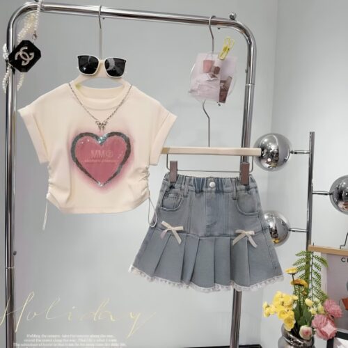
Electric Blue and Hot Pink: The Dopamine Dressing Effect
Electric blue zaps like lightning on a dull shirt. Hot pink flares brief but bright. These on trims or tees spark joy.
They contrast muted layers for that wow factor. A hot pink logo on sage pants pops. Electric blue socks add surprise under shorts.
The effect? Kids feel excited, ready for play. It’s like a treat in a neutral meal.
Neon Contrast Trims in Athleisure Kidswear
Neon edges on zippers or hems signal active fun. They mark performance gear, like joggers or tees for sports.
Bright piping helps visibility on walks. It modernizes basics, blending style with use. Brands mix it with earth tones for cool athleisure.
Real-World Example: Noting a Popular Brand’s Use of Contrast
Patagonia Kids nails this with muted olive bases and neon green trims on jackets. Their lines balance nature vibes with bold pops, perfect for outdoor play. Check their seasonal drops—it’s how to do accents right.
Texture and Tone: Materiality Influencing Colour Perception
Color isn’t just dye—fabrics change how it looks. Textures add layers, making shades feel alive. This boosts the aesthetic, turning simple clothes into art.
Choose materials that enhance hues. They create depth kids can touch and feel. It’s the secret to lasting appeal.
The Role of Undyed and Marled Fabrics
Undyed cottons keep natural flecks, softening colors like ecru. Marled yarns twist shades for subtle patterns. They mimic handmade charm.
Slub fabrics add bumps that catch light. Raw linen in sage breathes and ages well. These build authentic wardrobes.
Corduroy and Velvet: Deepening the Hue
Corduroy ridges make terracotta richer, like velvet cake. Velvet absorbs light, turning deep teal mysterious. Both add cozy weight.
Kids snuggle into them for story time. The pile shifts colors with movement. Flat jerseys can’t match that play.
Washing Effects: Achieving That Vintage Faded Look
Some dyes fade on purpose, gaining patina like old jeans. Butter yellow softens to cream over washes. This lived-in quality fits aesthetic trends.
Opt for colorfast options that mellow nicely. It saves money—clothes look new longer. Parents tip: Wash inside out for best results.
Conclusion: Curating a Timeless, Trending Wardrobe
This year, aesthetic kidswear colors trending lean muted and natural over bright blasts. Earth tones like sage and terracotta build strong bases. Muted pastels add soft play, while jewels and pops bring targeted flair.
Textures seal the deal, making hues pop in real life. You get versatile closets that fit any season. Focus on pieces that mix easy—your child’s style will shine.
Dress them in colors that nod to now but last. It’s about comfort, fun, and a touch of sophistication. Head to stores or online; build that capsule today and watch the magic unfold.